Role
Product Designer
Platform
Mobile, Web App
Team
Product Managers & Engineers
Focus
Usability, engagement, retention
Improving Engagement in an Employability Learning Platform


Project Brief
Improving usability and engagement in a learning platform designed to help students from rural communities explore career paths and develop employability skills.
The product was already live when I joined, but users were not spending enough time in the app and often dropped off early in their journey. As the sole UX designer, my responsibility was to understand where users were struggling and improve the experience in a way that encouraged continued learning.
Background
The platform was designed to help students from rural communities explore career paths and build employability skills. While the concept resonated with users, product analytics and user research revealed critical gaps in engagement and retention.
I worked to identify where users struggled and redesign the experience to encourage sustained learning and goal achievement.

Impact Summary

Sequential island progression
One-tap resume learning
In-app help & support
Current User Journey

Login / Sign Up


Select Career

Select Job Role

Baseline Assessment

Personalized Learning Journey Generated

Skill Level Evaluation
Analyze results of baseline test to determine individual's current skill level


Resumable Learning
Quickly pick up where you left off & continue learning seamlessly


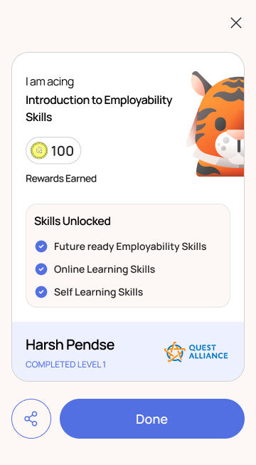
Progress Tracking & Completion
Track achievements and complete learning milestones


Core Challenges
Students often struggled to understand how the learning journey progressed and how each lesson connected to their career goals. The experience lacked clear progression cues, making it difficult for users to build momentum as they moved through the product.
Key challenges included:
•
Unclear learning progression – lessons existed but the journey between them did not feel guided or structured.
•
Difficulty resuming learning – users had to manually scroll through multiple islands to locate their last completed lesson.
•
Weak re-engagement mechanisms – there were no reminders or prompts encouraging users to return after interruptions.
•
Limited connection to user motivation – the platform did not capture why students chose a particular career path, making the learning journey feel less personal.
•
Lack of in-product support – users had no clear way to find help or raise issues when they felt stuck.
Through interviews and field discussions with students, it became clear that the product needed stronger guidance, clearer progression, and mechanisms that helped users continue their journey even after interruptions.
The challenge was therefore not just improving usability, but restructuring the experience into a guided system that supported progression, reinforced motivation, and encouraged users to continue learning.

Approach
Instead of addressing each issue individually, the focus was shifted toward restructuring the learning experience into a guided and supportive system.
The approach centered around improving three critical aspects of the product:
•
Clarity of progression – helping users understand where they are and what comes next.
•
Continuity of learning – reducing friction when users return after interruptions.
•
Motivation and engagement – connecting the learning journey with users' personal career goals.
To achieve this, several structural improvements were introduced.
First, the learning experience was redesigned into a structured island-based journey where lessons, activities, and assessments unlock sequentially. This provided users with a clear path and reinforced learning before moving to the next stage.
Second, continuity was improved through the introduction of Resume Learning, allowing users to instantly return to their last incomplete lesson instead of manually searching for their position in the journey.
Third, a career motivation module was introduced to capture why users chose a specific career path. Understanding this motivation helped frame the learning experience in a more meaningful way.


Design Solution
To address the structural and engagement challenges identified during research, I introduced a series of improvements focused on three key areas: structuring the learning experience, strengthening user motivation, and supporting continuity in the journey.
1
Structuring the Learning Journey
One of the core issues was the lack of clear progression. Users could access lessons, but the journey between them did not feel guided.
To solve this, the learning experience was redesigned into a structured island-based progression system. Each island represents a stage of learning and contains a combination of lessons, activities, and assessments. Islands unlock sequentially once the previous stage is completed, ensuring users move through the content step-by-step rather than jumping across modules.
This structure helped create a clearer sense of progression and reinforced learning before users advanced to the next stage.
2
Connecting Learning with User Motivation
Research also revealed that the platform did not capture why users chose a particular career path. Without this context, the learning journey often felt disconnected from personal goals.
To address this, I introduced a Career Motivation Module that captures the user's reason for choosing a specific career. This module allows the product to understand the user's aspirations and frame the learning journey around their intent.
By grounding the experience in user motivation, the platform could create a stronger emotional connection between the learning journey and the user's career goals.
3
Improving Continuity in Learning
Another major friction point was session interruption. When users left the app midway, they had to manually scroll through multiple islands to locate where they had stopped.
To remove this friction, I designed a Resume Learning functionality that detects the last incomplete lesson and allows users to immediately continue from that point.
This ensured users could re-enter their learning journey quickly and maintain momentum.
4
Strengthening Engagement & Re-engagement
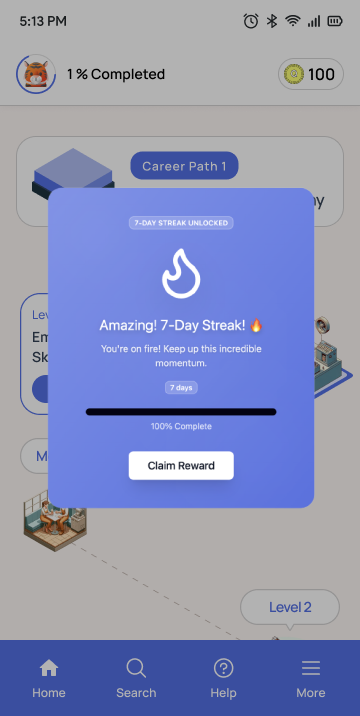
To support consistent usage, I introduced push notifications and in-app reminders that gently prompt users to return and continue their learning journey after interruptions.
These reminders were designed to feel supportive rather than intrusive, reinforcing the idea that the platform is helping users stay on track toward their career goals.
5
Supporting Users When They Get Stuck
Finally, to reduce frustration and prevent abandonment, I designed a Help and FAQ support system within the product.
This included a centralized help section, contextual FAQs, and the ability to raise support tickets. By providing accessible assistance within the app, users could resolve issues without leaving the learning experience.

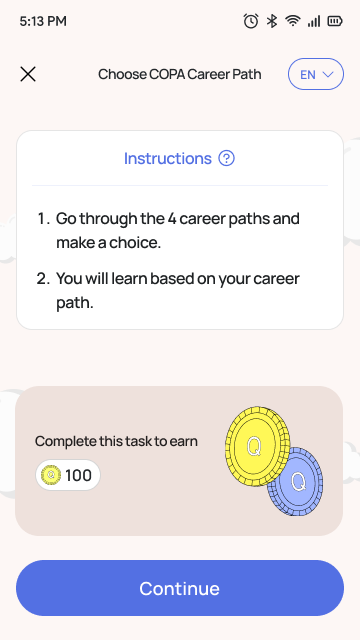
Interface Design
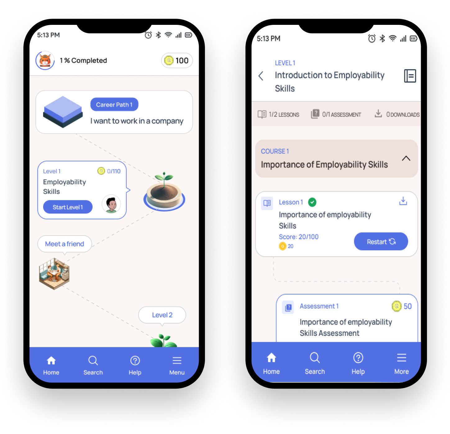
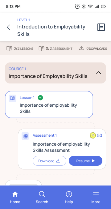
Island-based progression showing locked and unlocked stages with clear visual hierarchy

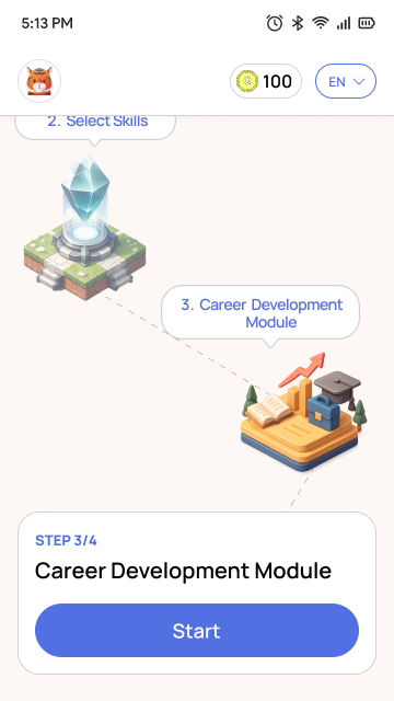
Interface Design
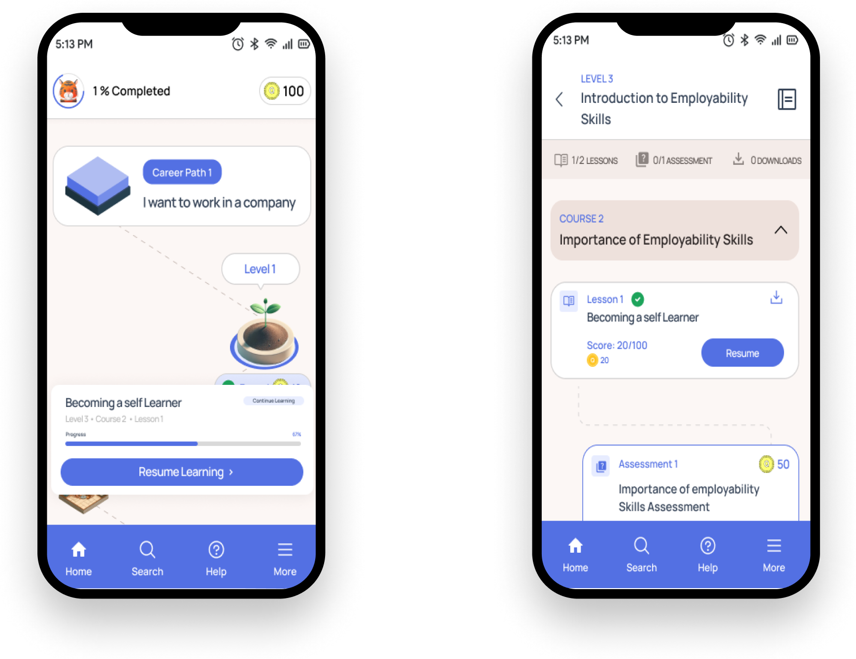
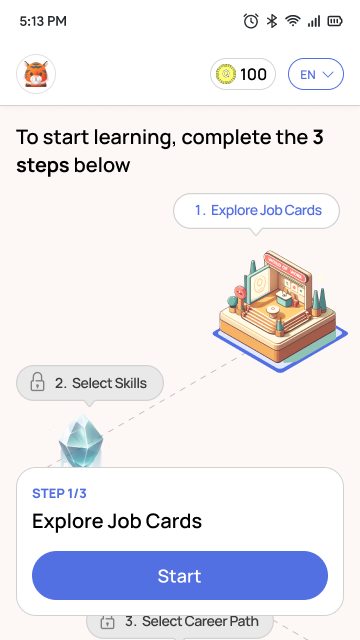
Module start screen with clear progression indicators and resume functionality

In App Notification
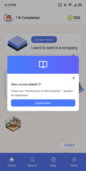
Push Notification
Interface Design
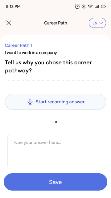
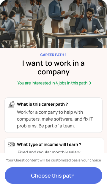
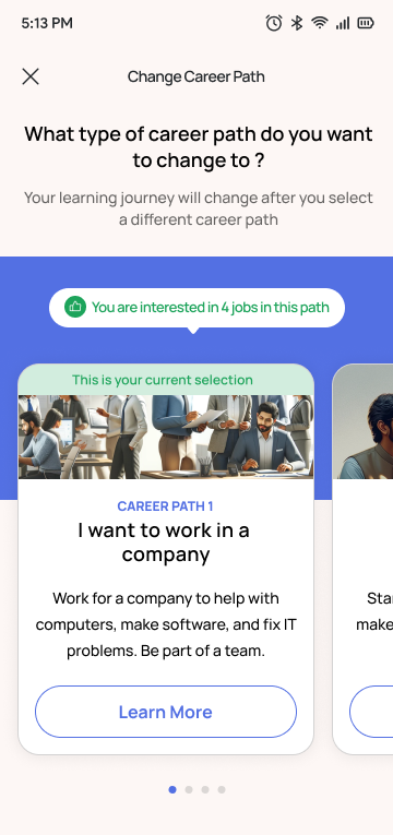
Career motivation module capturing user aspirations and framing the learning journey
Interface Design
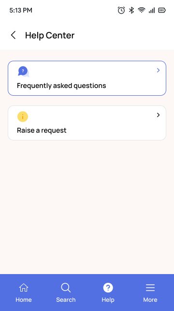
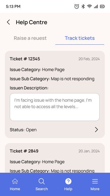
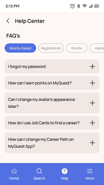
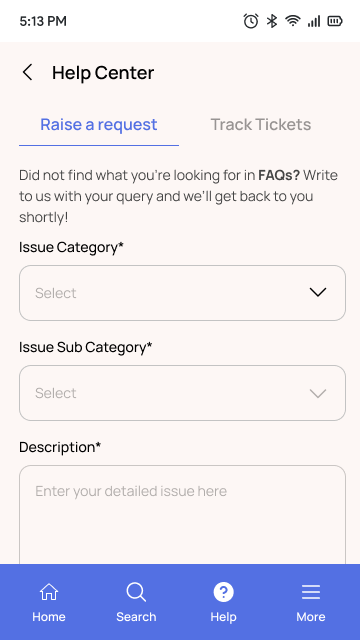
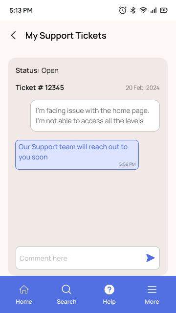
Reduced user frustration and provided pathways to resolution without abandoning progress.


Reflection
This project reinforced the importance of designing learning systems that prioritize structure, continuity, and motivation, particularly for users with varying levels of digital familiarity.
Rather than relying on large redesigns, incremental improvements in progression logic, engagement mechanisms, and support systems can significantly improve how users experience and continue their learning journey.


Clearer Learning Progression
The island-based journey provided users with a visible and predictable path, helping them understand what to complete next and how their learning advanced over time.


Discovery Process


User Interviews
Field discussions with students to understand pain points and learning behaviors


Product Analytics
Analyzing drop-off rates, session length, and usage patterns


Usability Testing
Observing how users navigated the learning journey
Design Principles
01
Clarity of Progression
Help users understand where they are and what comes next
02
Continuity of Learning
Reduce friction when users return after interruptions
03
Motivation & Engagement
Connect learning with personal career goals

MyQuest App

now

Your facilitator account has been activated! 🎓
You can now create batches, view learner progress and get other facilitator privileges!
View Dashboard
Later

MyQuest App

now

You are almost there! 💪
Current Progress
Continue your learning today, click here to complete your course on "Name of course"
67%

MyQuest App

now

You haven't logged in for a while 👋
New content and features await you!
Open App
Dismiss

MyQuest App

now

We've missed you! 🎓
We've added new courses just for you. Check them out and start learning today! 🚀


Outcome & Impact
The improvements introduced across the learning journey helped transform the product from a loosely connected set of lessons into a more structured and guided learning experience.

Improved Engagement & Continuity
Push notifications and in-app reminders encouraged users to return and continue their progress after interruptions.


Reduced Friction When Resuming
Resume Learning allowed users to quickly continue from their last incomplete lesson, eliminating the need to manually locate their position within the journey.
Stronger Connection to Career Goals
The Career Motivation Module helped align the learning journey with user aspirations, making the experience feel more meaningful and purposeful.
© Aryan Boonlia · Product Designer Built with Figma

Role
Product Designer
Platform
Mobile, Web App
Team
Product Managers & Engineers
Focus
Usability, engagement, retention
Improving Engagement in an Employability Learning Platform
Project Brief
Improving usability and engagement in a learning platform designed to help students from rural communities explore career paths and develop employability skills.
The product was already live when I joined, but users were not spending enough time in the app and often dropped off early in their journey. As the sole UX designer, my responsibility was to understand where users were struggling and improve the experience in a way that encouraged continued learning.
Background
The platform was designed to help students from rural communities explore career paths and build employability skills. While the concept resonated with users, product analytics and user research revealed critical gaps in engagement and retention.
I worked to identify where users struggled and redesign the experience to encourage sustained learning and goal achievement.
Impact Summary
Sequential island progression
One-tap resume learning
In-app help & support
Current User Journey
Login / Sign Up
Select Career
Select Job Role
Baseline Assessment
Personalized Learning Journey Generated
Skill Level Evaluation
Analyze results of baseline test to determine individual's current skill level
Resumable Learning
Quickly pick up where you left off & continue learning seamlessly
Progress Tracking & Completion
Track achievements and complete learning milestones
Core Challenges
Students often struggled to understand how the learning journey progressed and how each lesson connected to their career goals. The experience lacked clear progression cues, making it difficult for users to build momentum as they moved through the product.
Key challenges included:
•
Unclear learning progression – lessons existed but the journey between them did not feel guided or structured.
•
Difficulty resuming learning – users had to manually scroll through multiple islands to locate their last completed lesson.
•
Weak re-engagement mechanisms – there were no reminders or prompts encouraging users to return after interruptions.
•
Limited connection to user motivation – the platform did not capture why students chose a particular career path, making the learning journey feel less personal.
•
Lack of in-product support – users had no clear way to find help or raise issues when they felt stuck.
Through interviews and field discussions with students, it became clear that the product needed stronger guidance, clearer progression, and mechanisms that helped users continue their journey even after interruptions.
The challenge was therefore not just improving usability, but restructuring the experience into a guided system that supported progression, reinforced motivation, and encouraged users to continue learning.
Approach
Instead of addressing each issue individually, the focus was shifted toward restructuring the learning experience into a guided and supportive system.
The approach centered around improving three critical aspects of the product:
•
Clarity of progression – helping users understand where they are and what comes next.
•
Continuity of learning – reducing friction when users return after interruptions.
•
Motivation and engagement – connecting the learning journey with users' personal career goals.
To achieve this, several structural improvements were introduced.
First, the learning experience was redesigned into a structured island-based journey where lessons, activities, and assessments unlock sequentially. This provided users with a clear path and reinforced learning before moving to the next stage.
Second, continuity was improved through the introduction of Resume Learning, allowing users to instantly return to their last incomplete lesson instead of manually searching for their position in the journey.
Third, a career motivation module was introduced to capture why users chose a specific career path. Understanding this motivation helped frame the learning experience in a more meaningful way.
Design Solution
To address the structural and engagement challenges identified during research, I introduced a series of improvements focused on three key areas: structuring the learning experience, strengthening user motivation, and supporting continuity in the journey.
1
Structuring the Learning Journey
One of the core issues was the lack of clear progression. Users could access lessons, but the journey between them did not feel guided.
To solve this, the learning experience was redesigned into a structured island-based progression system. Each island represents a stage of learning and contains a combination of lessons, activities, and assessments. Islands unlock sequentially once the previous stage is completed, ensuring users move through the content step-by-step rather than jumping across modules.
This structure helped create a clearer sense of progression and reinforced learning before users advanced to the next stage.
2
Connecting Learning with User Motivation
Research also revealed that the platform did not capture why users chose a particular career path. Without this context, the learning journey often felt disconnected from personal goals.
To address this, I introduced a Career Motivation Module that captures the user's reason for choosing a specific career. This module allows the product to understand the user's aspirations and frame the learning journey around their intent.
By grounding the experience in user motivation, the platform could create a stronger emotional connection between the learning journey and the user's career goals.
3
Improving Continuity in Learning
Another major friction point was session interruption. When users left the app midway, they had to manually scroll through multiple islands to locate where they had stopped.
To remove this friction, I designed a Resume Learning functionality that detects the last incomplete lesson and allows users to immediately continue from that point.
This ensured users could re-enter their learning journey quickly and maintain momentum.
4
Strengthening Engagement & Re-engagement
To support consistent usage, I introduced push notifications and in-app reminders that gently prompt users to return and continue their learning journey after interruptions.
These reminders were designed to feel supportive rather than intrusive, reinforcing the idea that the platform is helping users stay on track toward their career goals.
5
Supporting Users When They Get Stuck
Finally, to reduce frustration and prevent abandonment, I designed a Help and FAQ support system within the product.
This included a centralized help section, contextual FAQs, and the ability to raise support tickets. By providing accessible assistance within the app, users could resolve issues without leaving the learning experience.
Interface Design
Island-based progression showing locked and unlocked stages with clear visual hierarchy
Interface Design
Module start screen with clear progression indicators and resume functionality
In App Notification
Push Notification
Interface Design
Career motivation module capturing user aspirations and framing the learning journey
Interface Design
Reduced user frustration and provided pathways to resolution without abandoning progress.
Reflection
This project reinforced the importance of designing learning systems that prioritize structure, continuity, and motivation, particularly for users with varying levels of digital familiarity.
Rather than relying on large redesigns, incremental improvements in progression logic, engagement mechanisms, and support systems can significantly improve how users experience and continue their learning journey.
Clearer Learning Progression
The island-based journey provided users with a visible and predictable path, helping them understand what to complete next and how their learning advanced over time.
Discovery Process


User Interviews
Field discussions with students to understand pain points and learning behaviors

Product Analytics
Analyzing drop-off rates, session length, and usage patterns


Usability Testing
Observing how users navigated the learning journey
Design Principles
01
Clarity of Progression
Help users understand where they are and what comes next
02
Continuity of Learning
Reduce friction when users return after interruptions
03
Motivation & Engagement
Connect learning with personal career goals
MyQuest App
now
Your facilitator account has been activated! 🎓
You can now create batches, view learner progress and get other facilitator privileges!
View Dashboard
Later
MyQuest App
now
You are almost there! 💪
Current Progress
Continue your learning today, click here to complete your course on "Name of course"
67%
MyQuest App
now
You haven't logged in for a while 👋
New content and features await you!
Open App
Dismiss
MyQuest App
now
We've missed you! 🎓
We've added new courses just for you. Check them out and start learning today! 🚀
Outcome & Impact
The improvements introduced across the learning journey helped transform the product from a loosely connected set of lessons into a more structured and guided learning experience.
Improved Engagement & Continuity
Push notifications and in-app reminders encouraged users to return and continue their progress after interruptions.
Reduced Friction When Resuming
Resume Learning allowed users to quickly continue from their last incomplete lesson, eliminating the need to manually locate their position within the journey.
Stronger Connection to Career Goals
The Career Motivation Module helped align the learning journey with user aspirations, making the experience feel more meaningful and purposeful.
© Aryan Boonlia · Product Designer Built with Figma