Role
Lead UI/UX Designer
INDUSTRY
Healthcare, MedTech
Platform
Web Dashboard
Team
PM, Engineers, Intern
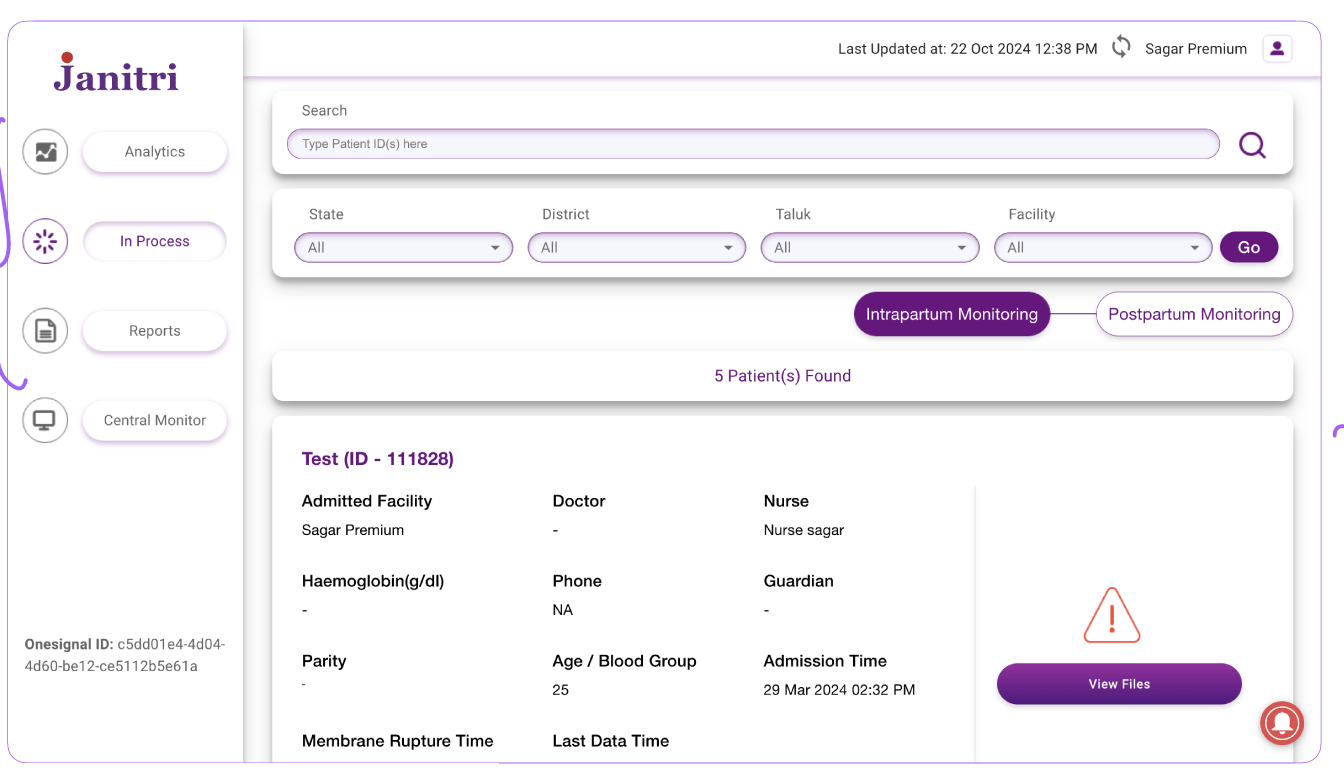
This product supports clinicians in monitoring maternity patients during labor and identifying potential risks in real time. The system allows nurses to observe patient vitals from the labor room while doctors and administrators can access the same information remotely.
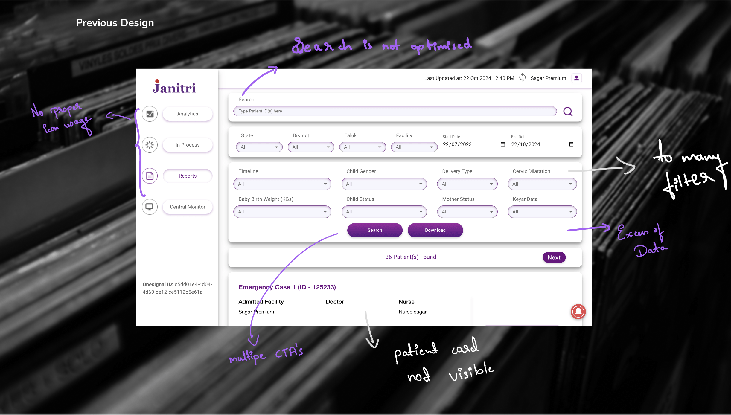
However, the existing interface struggled with poor information hierarchy, unclear alert visibility, and inefficient navigation between patient data. Clinicians often needed to scan through dense interfaces and multiple filters before identifying high-risk patients.
Design Goal
Improve how patient information is surfaced, ensuring clinicians can quickly identify urgent cases with minimal friction.


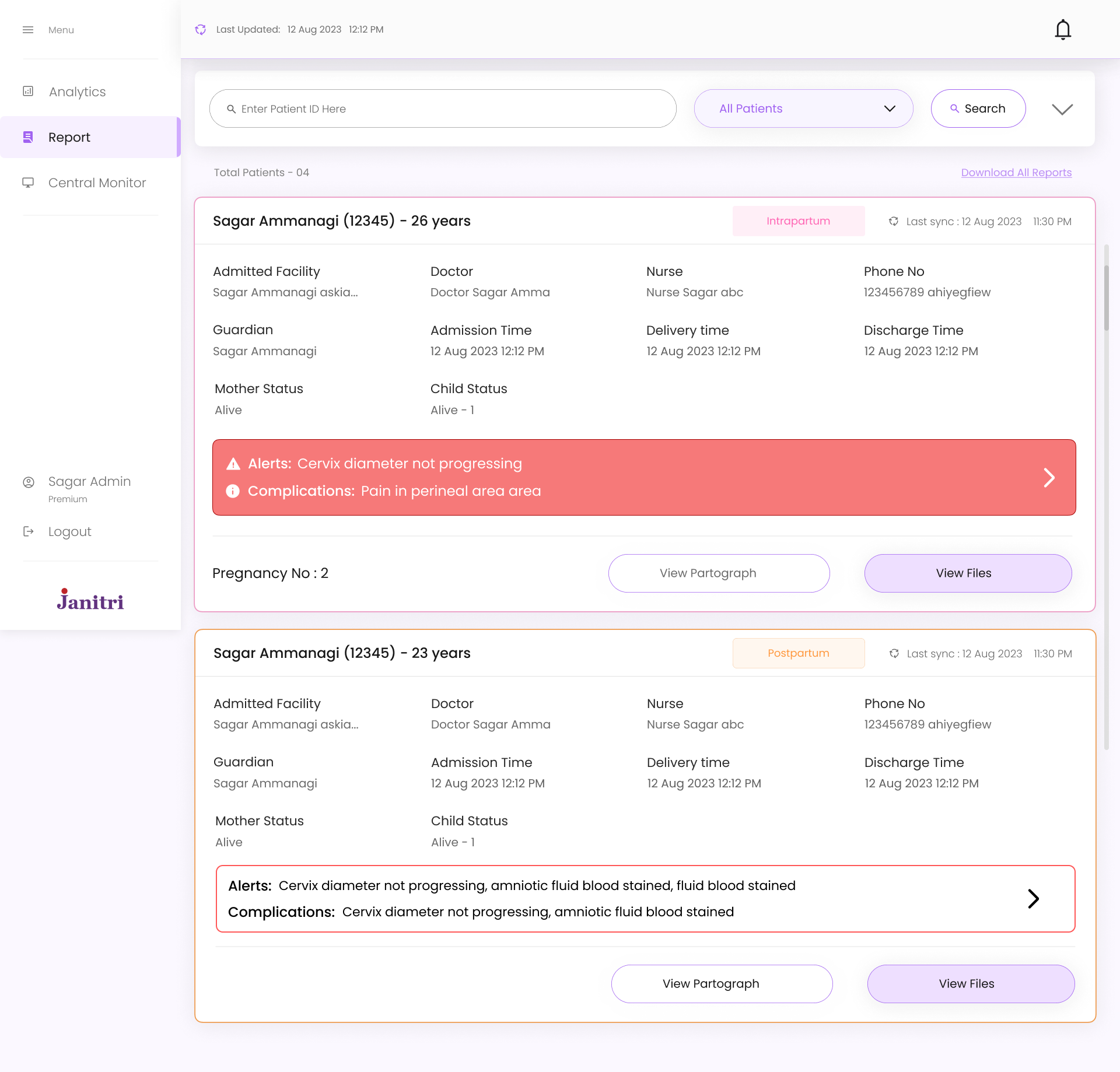
Search

All Patients

Total Patients - 04
Download All Reports
Enter Patient ID Here
Pregnancy No : 2
Last sync : 12 Aug 2023 11:30 PM
Sagar Ammanagi (12345) - 26 years
Admitted Facility
Doctor
Admission Time
Sagar Ammanagi askia...
Doctor Sagar Amma
12 Aug 2023 12:12 PM
12 Aug 2023 12:12 PM
Delivery time
Nurse Sagar abc
12 Aug 2023 12:12 PM
Nurse
Discharge Time
123456789 ahiyegfiew
Alive
Phone No
Mother Status
Sagar Ammanagi
Alive - 1
Guardian
Child Status


View Files
View Partograph
Intrapartum
Patient Reports

Analytics

Central Monitor


Logout
Sagar Admin
Premium


Menu

Last Updated:
12 Aug 2023 12:12 PM


Last Updated:
12 Aug 2023 12:12 PM
As the lead designer, I was responsible for defining the experience strategy and structuring the core workflows of the product.

Conducting research and identifying usability gaps

Designing information architecture and clinical workflows

Creating wireframes and defining dashboard structure

Establishing alert visibility and prioritization principles

Collaborating with product and engineering teams

Guiding UI design process and reviewing iterations
Problem Space
Understanding the Problem
Although the dashboard contained all necessary patient information, the interface structure did not match how clinicians interpreted and prioritized data during monitoring.

Delayed Identification
Critical alerts hidden within collapsible sections made it difficult to identify high-risk patients quickly

Cognitive Overload
Unclear hierarchy forced clinicians to read through multiple data points before understanding patient condition

Navigation Friction
Complex filtering and multi-step navigation slowed down access to patient records
"In clinical environments where time is critical, these small usability gaps significantly impacted workflow efficiency."
Research
Key Insights
Understanding how clinicians interpret patient data was essential to defining the redesign direction. Healthcare professionals rely heavily on rapid visual scanning when reviewing patient lists.
INSIGHT 01
Visibility is Critical
Critical alerts must remain visible without additional interaction. Hidden information delays response time.
INSIGHT 02
Hierarchy Matters
Patient information must follow a clear visual hierarchy to support rapid scanning and prioritization.
INSIGHT 03
Reduce Friction
Every unnecessary step in accessing patient data creates delay. Workflows should be streamlined.
Strategy
Design Approach
The redesign focused on improving three core aspects of the experience
PRIORITY HIGH
Alert Visibility
Critical alerts were redesigned to remain visible directly within the dashboard rather than hidden in collapsible sections. This allows immediate identification of high-risk patients.
STRUCTURE
Information Hierarchy
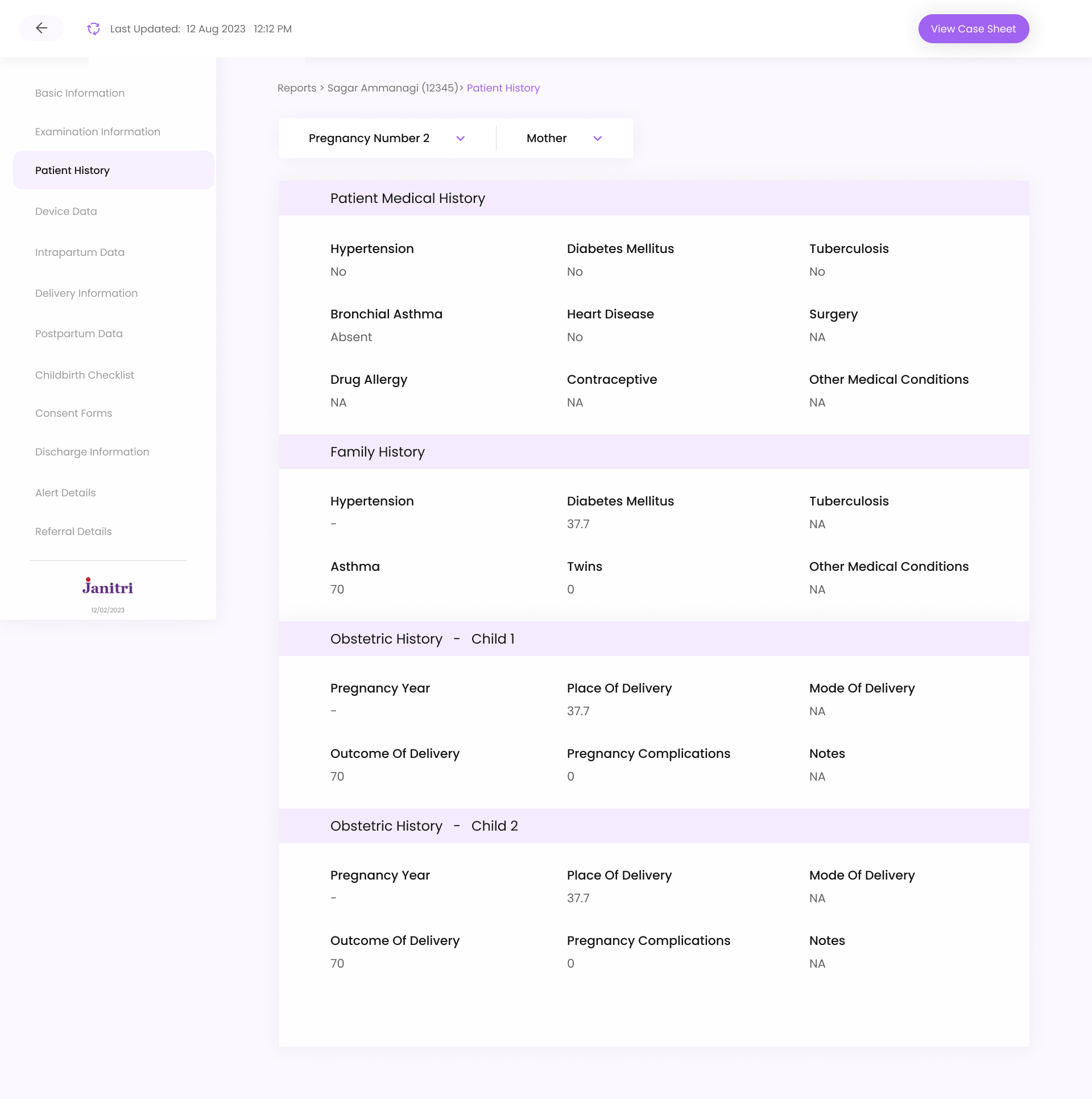
A “View Case Sheet” action was also introduced, allowing nurses to download or print an L3-aligned case sheet directly from the system, replacing the earlier manual paperwork process
EFFICIENCY
Navigation Flow
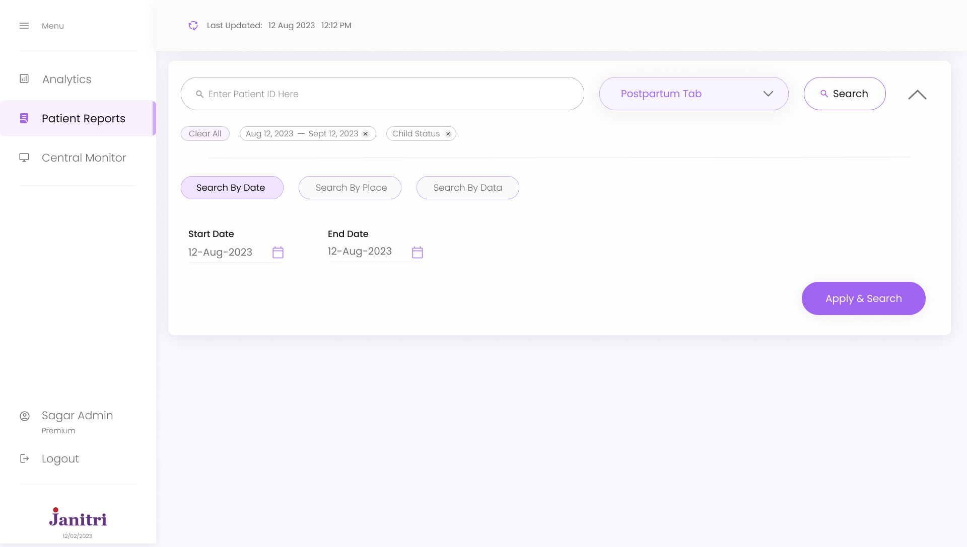
Simplified filtering and navigation between patient views to reduce interaction friction and enable faster access to patient data.
Solution
Patient Card Redesign
Patient cards were redesigned to highlight critical information immediately while keeping supporting details accessible but visually secondary.
Before
• Hidden alerts
• Unclear hierarchy
• Dense information
After
✓ Visible alerts
✓ Clear hierarchy
✓ Scannable layout
Alert conditions
Delayed synchronization
Active monitoring
Device disconnection


HEALTHCARE UX · 2024
Maternity Care
Monitoring Dashboard
Redesigning clinical workflows to help healthcare professionals identify critical cases faster and monitor patients more efficiently
Information Architecture
Dashboard Structure
Mapping out the core navigation, patient management flows, and monitoring features to support clinical decision-making

Dashboard Home

Patient List View
Filters & Sort

By Status
By Risk Level
By Room
Search

By Name
By Patient ID
Quick Actions

Add Patient
Refresh Data
Patient Card

Basic Info
Alert Status
Vitals
Patient Details

Full Record
Medical History
Notes

Heart Rate
Contractions
Sync Status
Live Monitoring ★
View Full Details
Add Notes
Alert History


Overview
Understanding the Product
My Role
Design Leadership
Monitoring
Real-Time Patient Monitoring
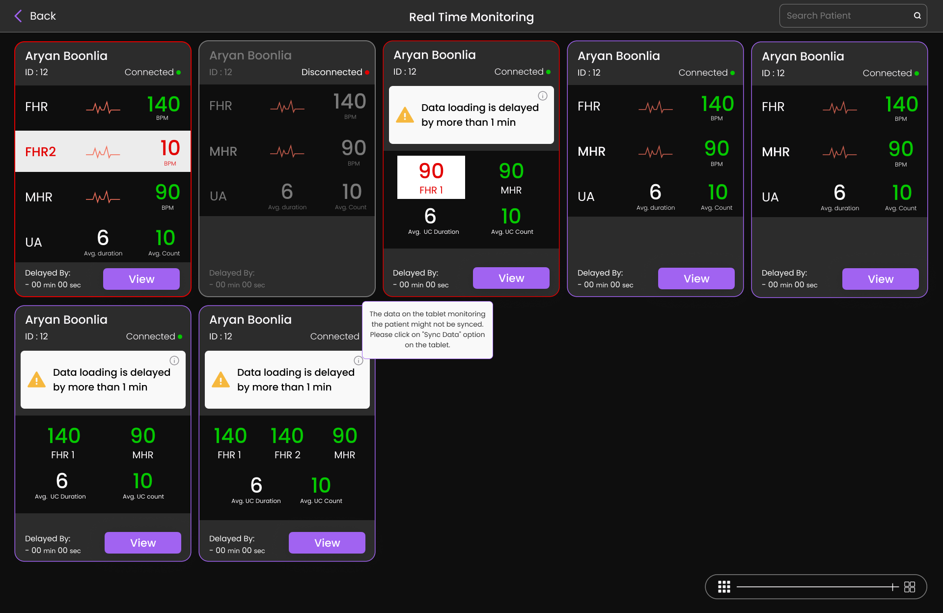
In addition to the dashboard, the system also supports real-time patient monitoring, allowing clinicians to observe patient vitals continuously.
The central monitoring interface enables staff in the labor room to track patients while doctors or administrators can monitor the same data remotely.
During research, one issue identified was uncertainty around data synchronization delays. Clinicians could see patient vitals but could not always determine whether the data was fully synced with the monitoring devices.
To address this, I designed a system that surfaces synchronization delays directly within patient cards.
If patient data is delayed for more than one minute, a warning appears on the card, ensuring clinicians understand when the data may not represent the most current patient condition
Live Monitoring Interface
Detailed monitoring interface visualizing real-time physiological signals with improved readability and contrast.

Fetal heart rate

Maternal heart rate

Uterine activity

Contraction patterns
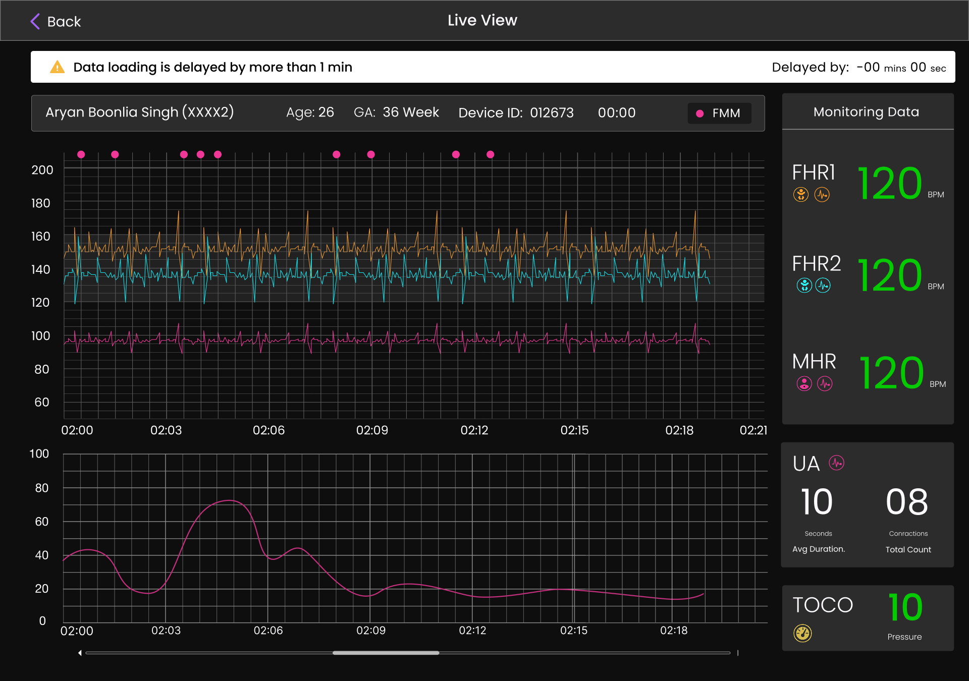
Design Decision
A dark theme was introduced to improve graph visibility and contrast, making it easier for clinicians to read signals during extended monitoring sessions.
Impact
Results

Improved Alert Visibility
Critical alerts now visible without additional interaction

Faster Navigation
Reduced steps to access patient records and data

Clearer Hierarchy
Better information structure for rapid scanning
"The redesigned interface improves visibility of critical alerts and reduces cognitive load, helping clinicians identify urgent cases faster."
View next case study →
← Go back
© Aryan Boonlia · Product Designer Built with Figma
Role
Lead UI/UX Designer
INDUSTRY
Healthcare, MedTech
Platform
Web Dashboard
Team
PM, Engineers, Intern
This product supports clinicians in monitoring maternity patients during labor and identifying potential risks in real time. The system allows nurses to observe patient vitals from the labor room while doctors and administrators can access the same information remotely.
However, the existing interface struggled with poor information hierarchy, unclear alert visibility, and inefficient navigation between patient data. Clinicians often needed to scan through dense interfaces and multiple filters before identifying high-risk patients.
Design Goal
Improve how patient information is surfaced, ensuring clinicians can quickly identify urgent cases with minimal friction.
Search
All Patients
Total Patients - 04
Download All Reports
Enter Patient ID Here
Pregnancy No : 2
Last sync : 12 Aug 2023 11:30 PM
Sagar Ammanagi (12345) - 26 years
Admitted Facility
Doctor
Admission Time
Sagar Ammanagi askia...
Doctor Sagar Amma
12 Aug 2023 12:12 PM
12 Aug 2023 12:12 PM
Delivery time
Nurse Sagar abc
12 Aug 2023 12:12 PM
Nurse
Discharge Time
123456789 ahiyegfiew
Alive
Phone No
Mother Status
Sagar Ammanagi
Alive - 1
Guardian
Child Status
View Files
View Partograph
Intrapartum
Patient Reports
Analytics
Central Monitor
Logout
Sagar Admin
Premium
Menu
Last Updated:
12 Aug 2023 12:12 PM
Last Updated:
12 Aug 2023 12:12 PM
As the lead designer, I was responsible for defining the experience strategy and structuring the core workflows of the product.
Conducting research and identifying usability gaps
Designing information architecture and clinical workflows
Creating wireframes and defining dashboard structure
Establishing alert visibility and prioritization principles
Collaborating with product and engineering teams
Guiding UI design process and reviewing iterations
Problem Space
Understanding the Problem
Although the dashboard contained all necessary patient information, the interface structure did not match how clinicians interpreted and prioritized data during monitoring.
Delayed Identification
Critical alerts hidden within collapsible sections made it difficult to identify high-risk patients quickly
Cognitive Overload
Unclear hierarchy forced clinicians to read through multiple data points before understanding patient condition
Navigation Friction
Complex filtering and multi-step navigation slowed down access to patient records
"In clinical environments where time is critical, these small usability gaps significantly impacted workflow efficiency."
Research
Key Insights
Understanding how clinicians interpret patient data was essential to defining the redesign direction. Healthcare professionals rely heavily on rapid visual scanning when reviewing patient lists.
INSIGHT 01
Visibility is Critical
Critical alerts must remain visible without additional interaction. Hidden information delays response time.
INSIGHT 02
Hierarchy Matters
Patient information must follow a clear visual hierarchy to support rapid scanning and prioritization.
INSIGHT 03
Reduce Friction
Every unnecessary step in accessing patient data creates delay. Workflows should be streamlined.
Strategy
Design Approach
The redesign focused on improving three core aspects of the experience
PRIORITY HIGH
Alert Visibility
Critical alerts were redesigned to remain visible directly within the dashboard rather than hidden in collapsible sections. This allows immediate identification of high-risk patients.
STRUCTURE
Information Hierarchy
A “View Case Sheet” action was also introduced, allowing nurses to download or print an L3-aligned case sheet directly from the system, replacing the earlier manual paperwork process
EFFICIENCY
Navigation Flow
Simplified filtering and navigation between patient views to reduce interaction friction and enable faster access to patient data.
Solution
Patient Card Redesign
Patient cards were redesigned to highlight critical information immediately while keeping supporting details accessible but visually secondary.
Before
• Hidden alerts
• Unclear hierarchy
• Dense information
After
✓ Visible alerts
✓ Clear hierarchy
✓ Scannable layout
Alert conditions
Delayed synchronization
Active monitoring
Device disconnection
HEALTHCARE UX · 2024
Maternity Care
Monitoring Dashboard
Redesigning clinical workflows to help healthcare professionals identify critical cases faster and monitor patients more efficiently
Information Architecture
Dashboard Structure
Mapping out the core navigation, patient management flows, and monitoring features to support clinical decision-making
Dashboard Home
Patient List View
Filters & Sort
By Status
By Risk Level
By Room
Search
By Name
By Patient ID
Quick Actions
Add Patient
Refresh Data
Patient Card
Basic Info
Alert Status
Vitals
Patient Details
Full Record
Medical History
Notes
Heart Rate
Contractions
Sync Status
Live Monitoring ★
View Full Details
Add Notes
Alert History


Overview
Understanding the Product
My Role
Design Leadership
Monitoring
Real-Time Patient Monitoring
In addition to the dashboard, the system also supports real-time patient monitoring, allowing clinicians to observe patient vitals continuously.
The central monitoring interface enables staff in the labor room to track patients while doctors or administrators can monitor the same data remotely.
During research, one issue identified was uncertainty around data synchronization delays. Clinicians could see patient vitals but could not always determine whether the data was fully synced with the monitoring devices.
To address this, I designed a system that surfaces synchronization delays directly within patient cards.
If patient data is delayed for more than one minute, a warning appears on the card, ensuring clinicians understand when the data may not represent the most current patient condition
Live Monitoring Interface
Detailed monitoring interface visualizing real-time physiological signals with improved readability and contrast.
Fetal heart rate
Maternal heart rate
Uterine activity
Contraction patterns
Design Decision
A dark theme was introduced to improve graph visibility and contrast, making it easier for clinicians to read signals during extended monitoring sessions.
Impact
Results
Improved Alert Visibility
Critical alerts now visible without additional interaction
Faster Navigation
Reduced steps to access patient records and data
Clearer Hierarchy
Better information structure for rapid scanning
"The redesigned interface improves visibility of critical alerts and reduces cognitive load, helping clinicians identify urgent cases faster."
View next case study →
← Go back
© Aryan Boonlia · Product Designer Built with Figma
Role
Lead UI/UX Designer
INDUSTRY
Healthcare, MedTech
Platform
Web Dashboard
Team
PM, Engineers, Intern
This product supports clinicians in monitoring maternity patients during labor and identifying potential risks in real time. The system allows nurses to observe patient vitals from the labor room while doctors and administrators can access the same information remotely.
However, the existing interface struggled with poor information hierarchy, unclear alert visibility, and inefficient navigation between patient data. Clinicians often needed to scan through dense interfaces and multiple filters before identifying high-risk patients.
Design Goal
Improve how patient information is surfaced, ensuring clinicians can quickly identify urgent cases with minimal friction.
Search
All Patients
Total Patients - 04
Download All Reports
Enter Patient ID Here
Pregnancy No : 2
Last sync : 12 Aug 2023 11:30 PM
Sagar Ammanagi (12345) - 26 years
Admitted Facility
Doctor
Admission Time
Sagar Ammanagi askia...
Doctor Sagar Amma
12 Aug 2023 12:12 PM
12 Aug 2023 12:12 PM
Delivery time
Nurse Sagar abc
12 Aug 2023 12:12 PM
Nurse
Discharge Time
123456789 ahiyegfiew
Alive
Phone No
Mother Status
Sagar Ammanagi
Alive - 1
Guardian
Child Status
View Files
View Partograph
Intrapartum
Patient Reports
Analytics
Central Monitor
Logout
Sagar Admin
Premium
Menu
Last Updated:
12 Aug 2023 12:12 PM
Last Updated:
12 Aug 2023 12:12 PM
As the lead designer, I was responsible for defining the experience strategy and structuring the core workflows of the product.
Conducting research and identifying usability gaps
Designing information architecture and clinical workflows
Creating wireframes and defining dashboard structure
Establishing alert visibility and prioritization principles
Collaborating with product and engineering teams
Guiding UI design process and reviewing iterations
Problem Space
Understanding the Problem
Although the dashboard contained all necessary patient information, the interface structure did not match how clinicians interpreted and prioritized data during monitoring.
Delayed Identification
Critical alerts hidden within collapsible sections made it difficult to identify high-risk patients quickly
Cognitive Overload
Unclear hierarchy forced clinicians to read through multiple data points before understanding patient condition
Navigation Friction
Complex filtering and multi-step navigation slowed down access to patient records
"In clinical environments where time is critical, these small usability gaps significantly impacted workflow efficiency."
Research
Key Insights
Understanding how clinicians interpret patient data was essential to defining the redesign direction. Healthcare professionals rely heavily on rapid visual scanning when reviewing patient lists.
INSIGHT 01
Visibility is Critical
Critical alerts must remain visible without additional interaction. Hidden information delays response time.
INSIGHT 02
Hierarchy Matters
Patient information must follow a clear visual hierarchy to support rapid scanning and prioritization.
INSIGHT 03
Reduce Friction
Every unnecessary step in accessing patient data creates delay. Workflows should be streamlined.
Strategy
Design Approach
The redesign focused on improving three core aspects of the experience
PRIORITY HIGH
Alert Visibility
Critical alerts were redesigned to remain visible directly within the dashboard rather than hidden in collapsible sections. This allows immediate identification of high-risk patients.
STRUCTURE
Information Hierarchy
A “View Case Sheet” action was also introduced, allowing nurses to download or print an L3-aligned case sheet directly from the system, replacing the earlier manual paperwork process
EFFICIENCY
Navigation Flow
Simplified filtering and navigation between patient views to reduce interaction friction and enable faster access to patient data.
Solution
Patient Card Redesign
Patient cards were redesigned to highlight critical information immediately while keeping supporting details accessible but visually secondary.
Before
• Hidden alerts
• Unclear hierarchy
• Dense information
After
✓ Visible alerts
✓ Clear hierarchy
✓ Scannable layout
Alert conditions
Delayed synchronization
Active monitoring
Device disconnection
HEALTHCARE UX · 2024
Maternity Care
Monitoring Dashboard
Redesigning clinical workflows to help healthcare professionals identify critical cases faster and monitor patients more efficiently
Information Architecture
Dashboard Structure
Mapping out the core navigation, patient management flows, and monitoring features to support clinical decision-making
Dashboard Home
Patient List View
Filters & Sort
By Status
By Risk Level
By Room
Search
By Name
By Patient ID
Quick Actions
Add Patient
Refresh Data
Patient Card
Basic Info
Alert Status
Vitals
Patient Details
Full Record
Medical History
Notes
Heart Rate
Contractions
Sync Status
Live Monitoring ★
View Full Details
Add Notes
Alert History
Overview
Understanding the Product
My Role
Design Leadership
Monitoring
Real-Time Patient Monitoring
In addition to the dashboard, the system also supports real-time patient monitoring, allowing clinicians to observe patient vitals continuously.
The central monitoring interface enables staff in the labor room to track patients while doctors or administrators can monitor the same data remotely.
During research, one issue identified was uncertainty around data synchronization delays. Clinicians could see patient vitals but could not always determine whether the data was fully synced with the monitoring devices.
To address this, I designed a system that surfaces synchronization delays directly within patient cards.
If patient data is delayed for more than one minute, a warning appears on the card, ensuring clinicians understand when the data may not represent the most current patient condition
Live Monitoring Interface
Detailed monitoring interface visualizing real-time physiological signals with improved readability and contrast.
Fetal heart rate
Maternal heart rate
Uterine activity
Contraction patterns
Design Decision
A dark theme was introduced to improve graph visibility and contrast, making it easier for clinicians to read signals during extended monitoring sessions.
Impact
Results
Improved Alert Visibility
Critical alerts now visible without additional interaction
Faster Navigation
Reduced steps to access patient records and data
Clearer Hierarchy
Better information structure for rapid scanning
"The redesigned interface improves visibility of critical alerts and reduces cognitive load, helping clinicians identify urgent cases faster."
View next case study →
← Go back
© Aryan Boonlia · Product Designer Built with Figma